A concept built on restraint for a patisserie that lets the craft speak.
Calm by design.
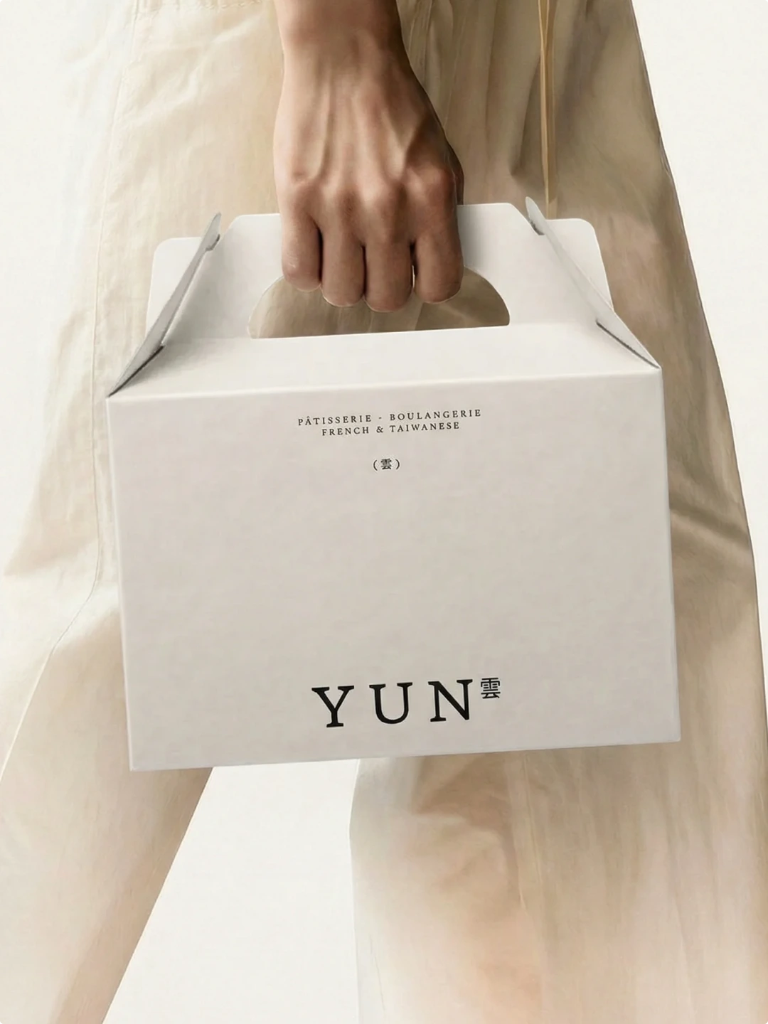
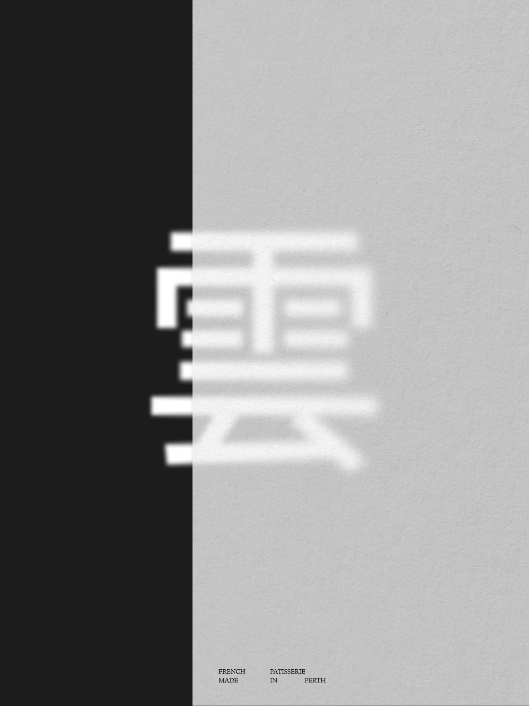
YUN is a luxury patisserie and tea house concept, blending refined pastry craft with Taiwanese tea culture. The brief called for restraint. In a hospitality landscape full of bold claims and busy branding, YUN needed to do the opposite – trust the work, and let the details do the talking.
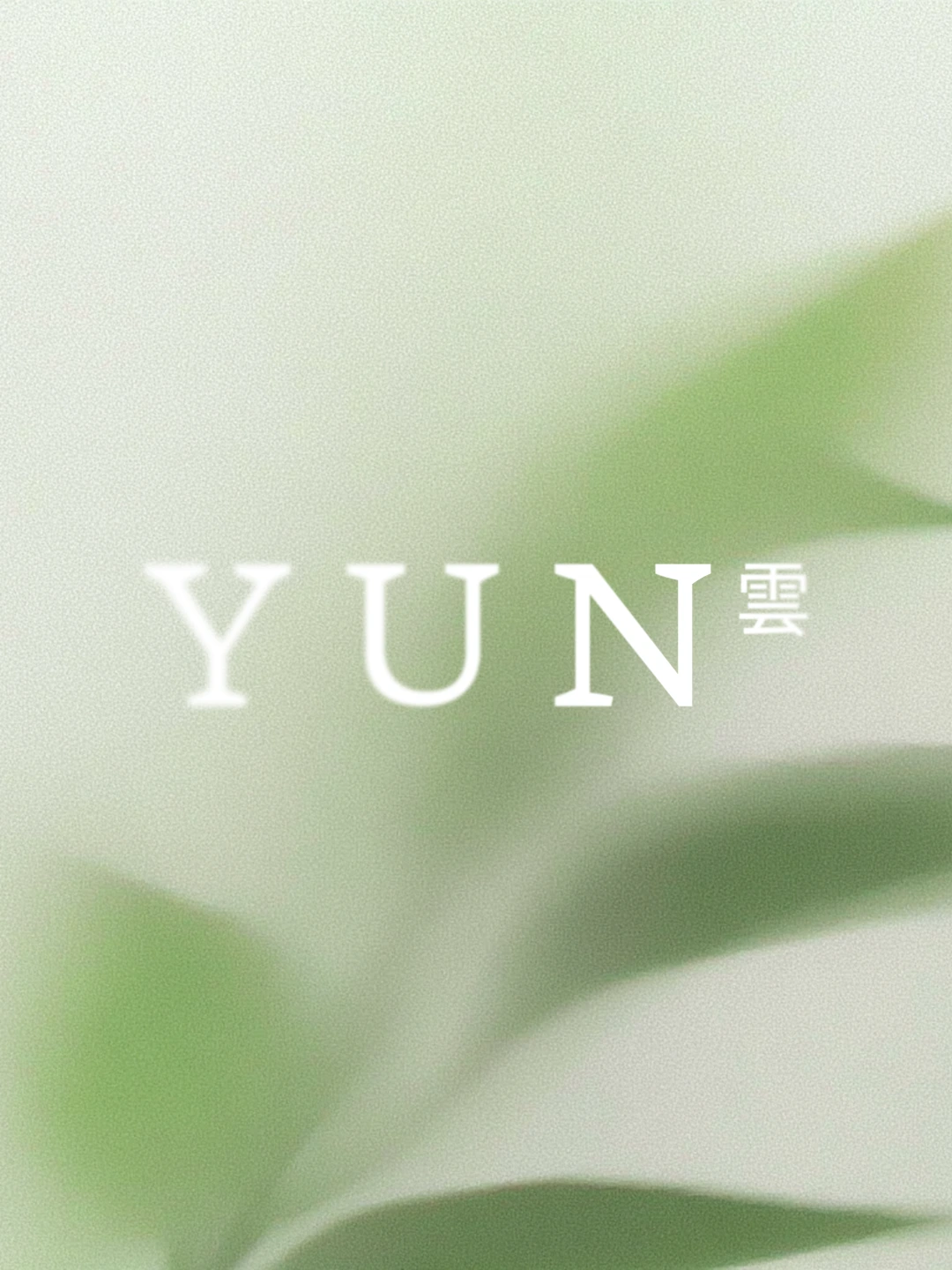
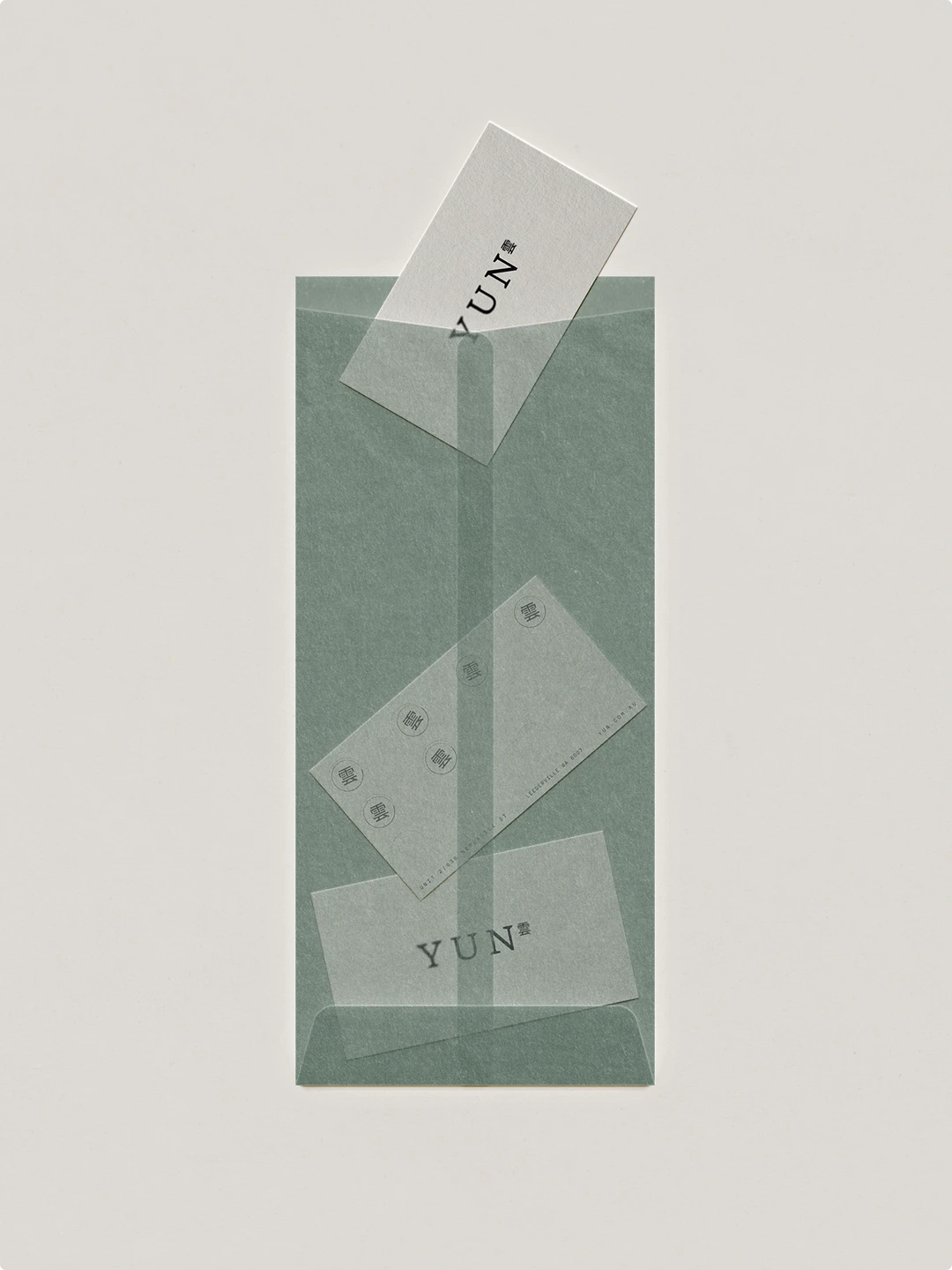
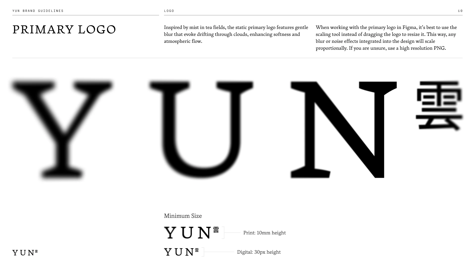
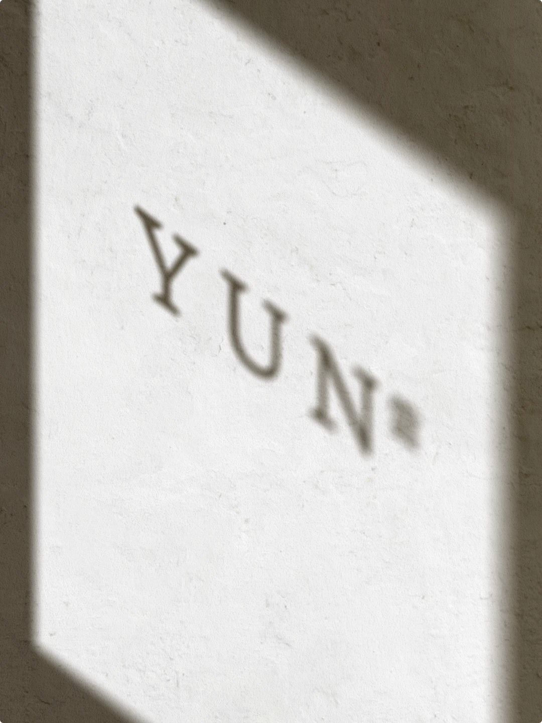
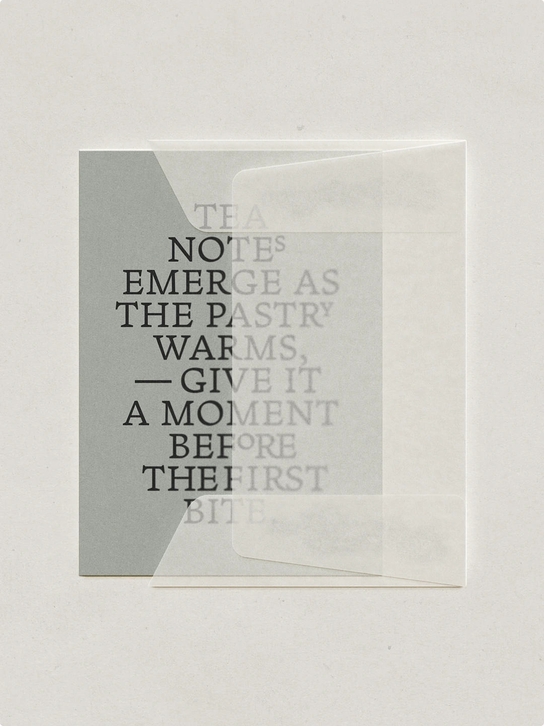
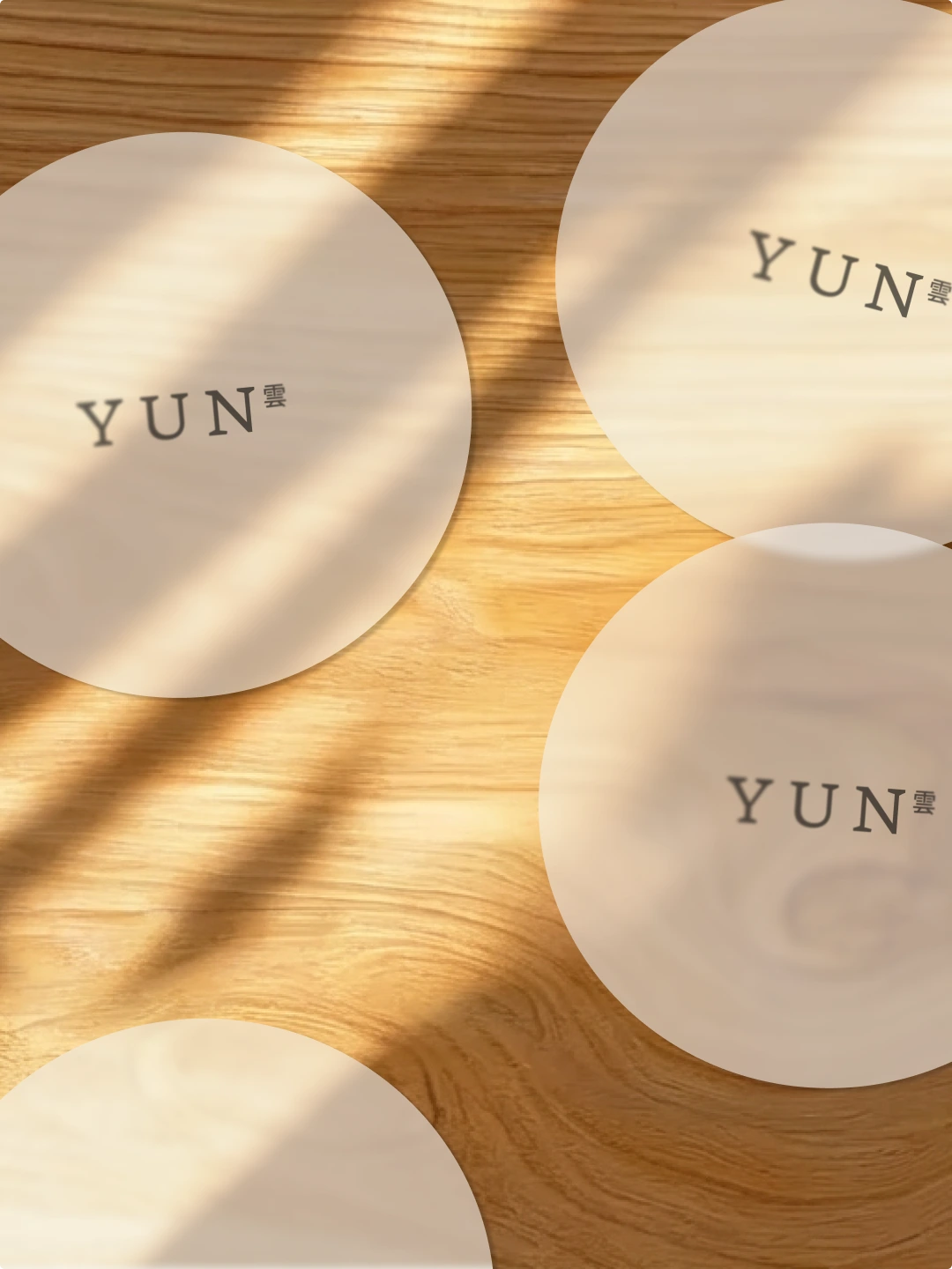
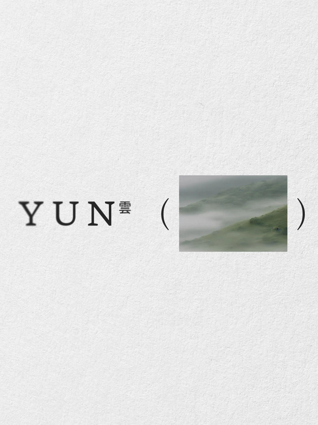
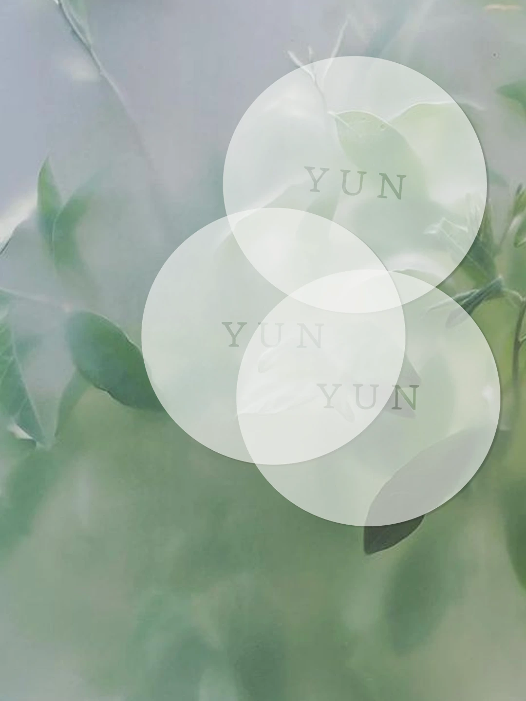
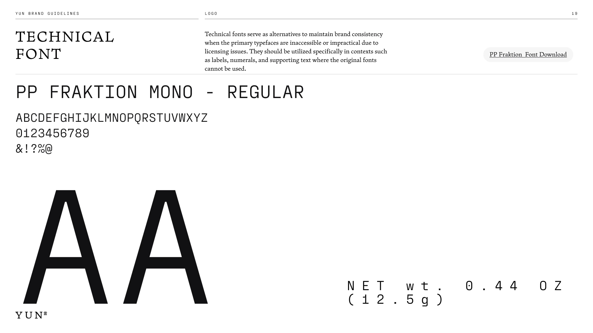
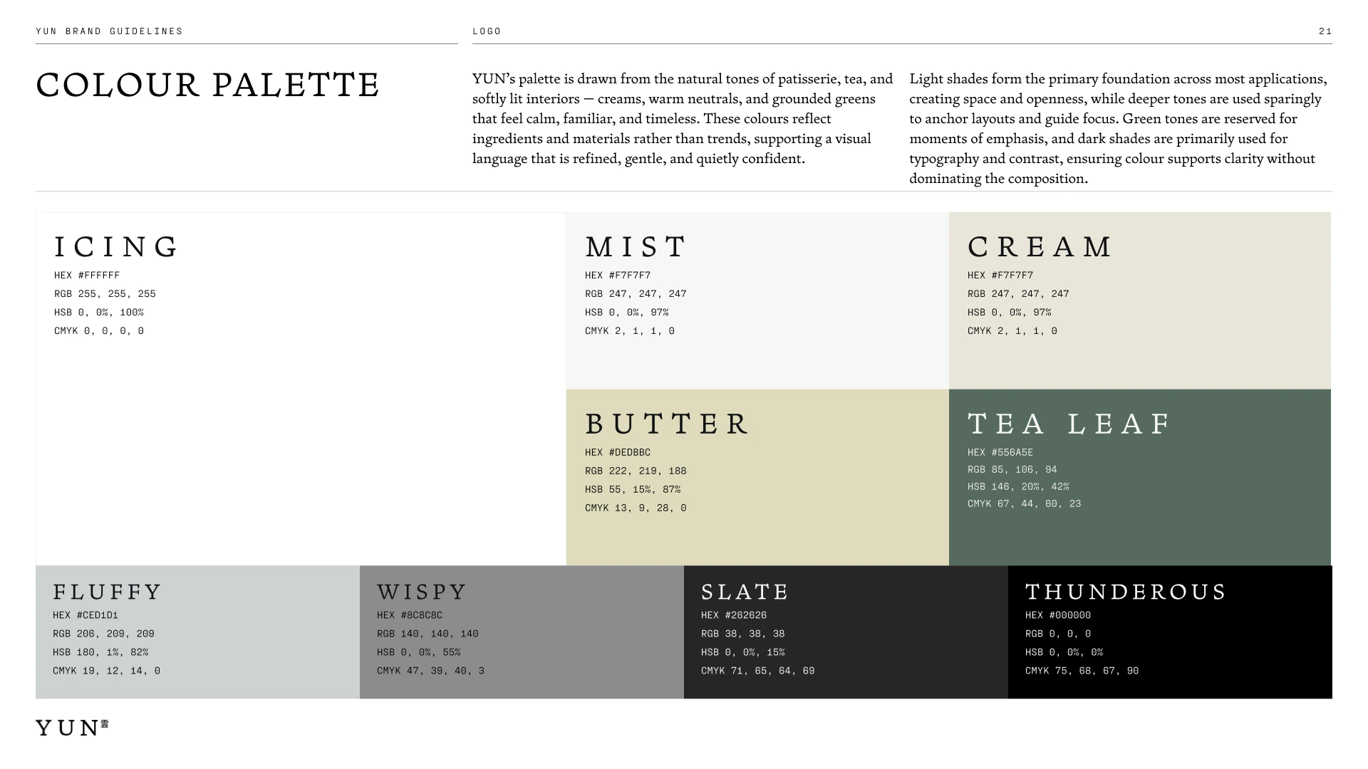
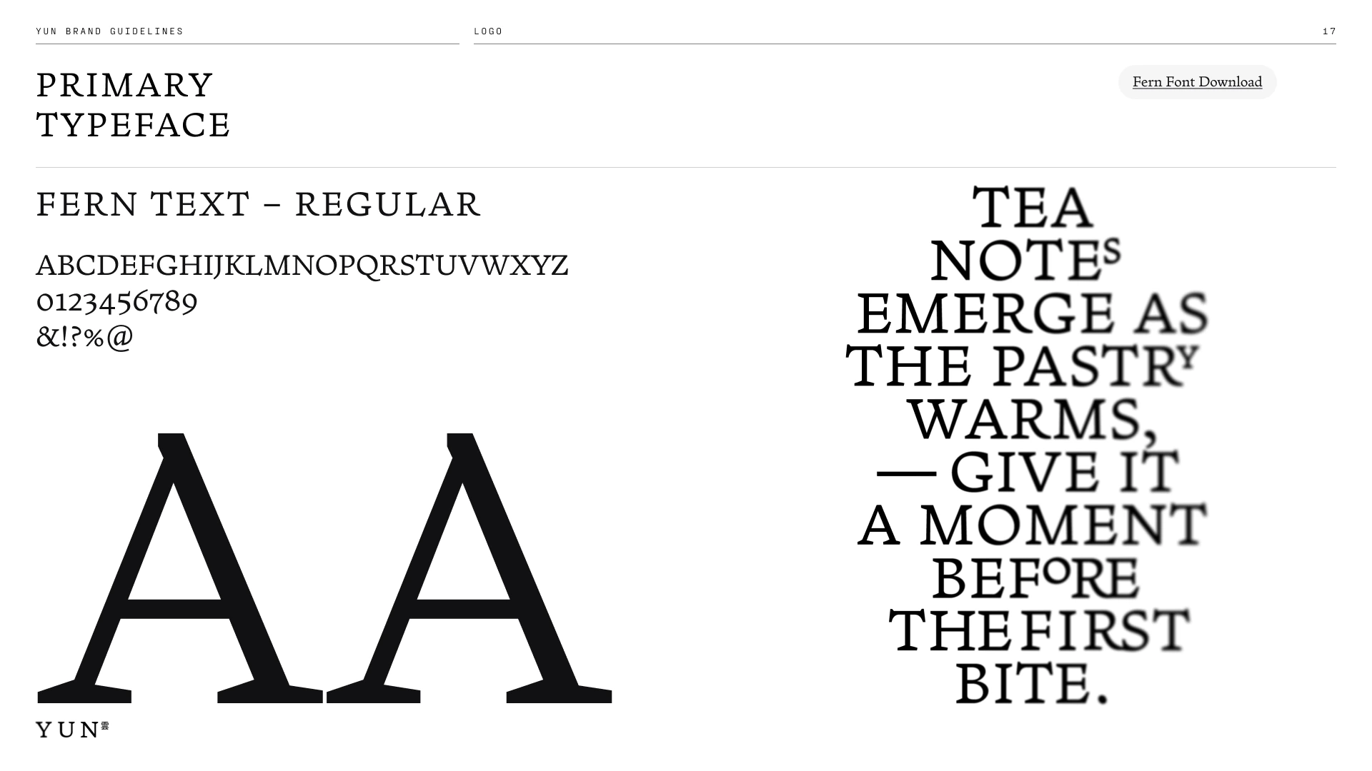
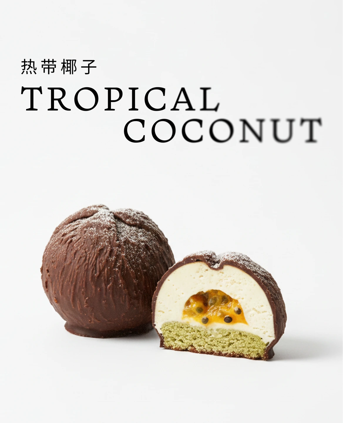
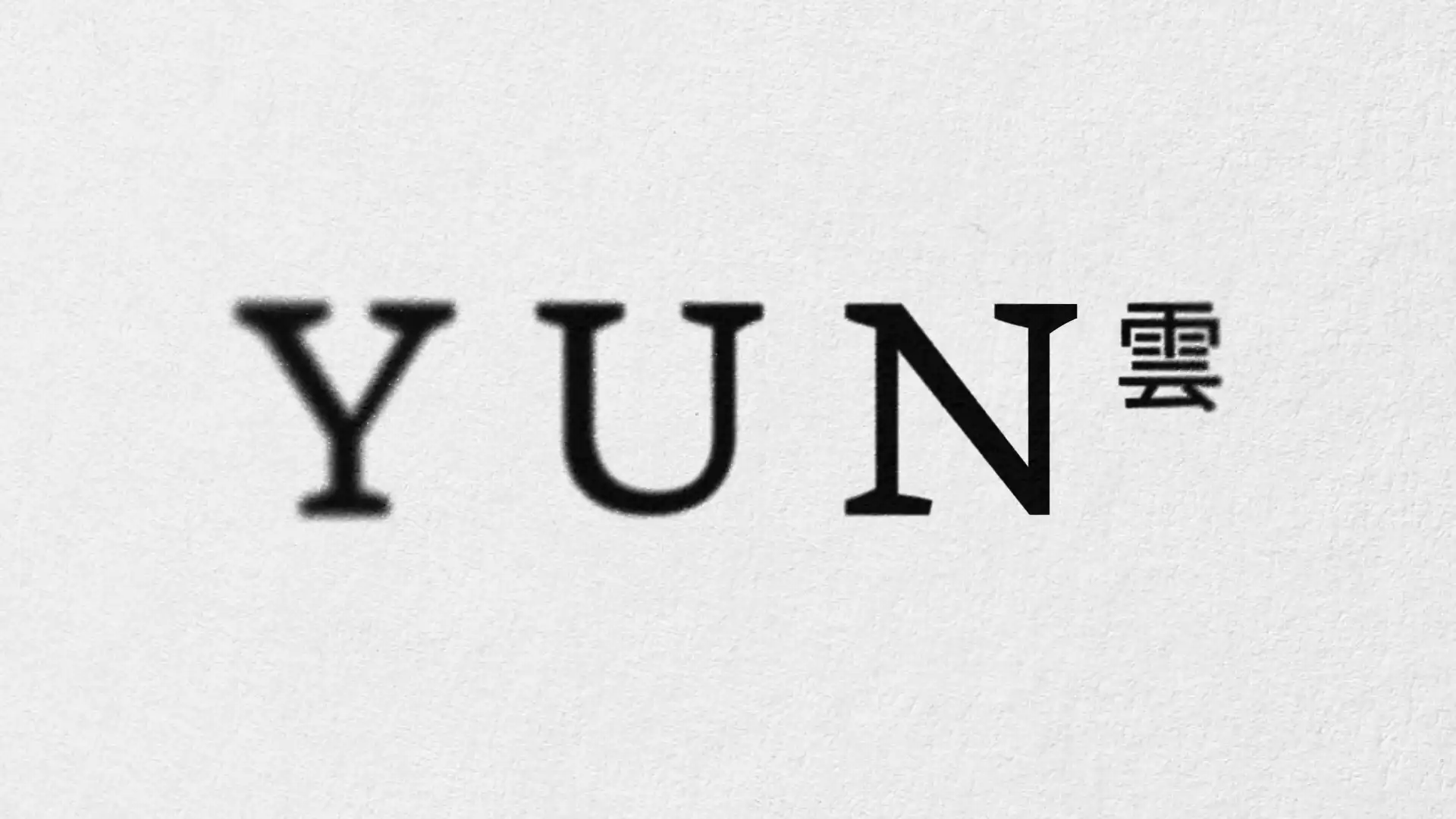
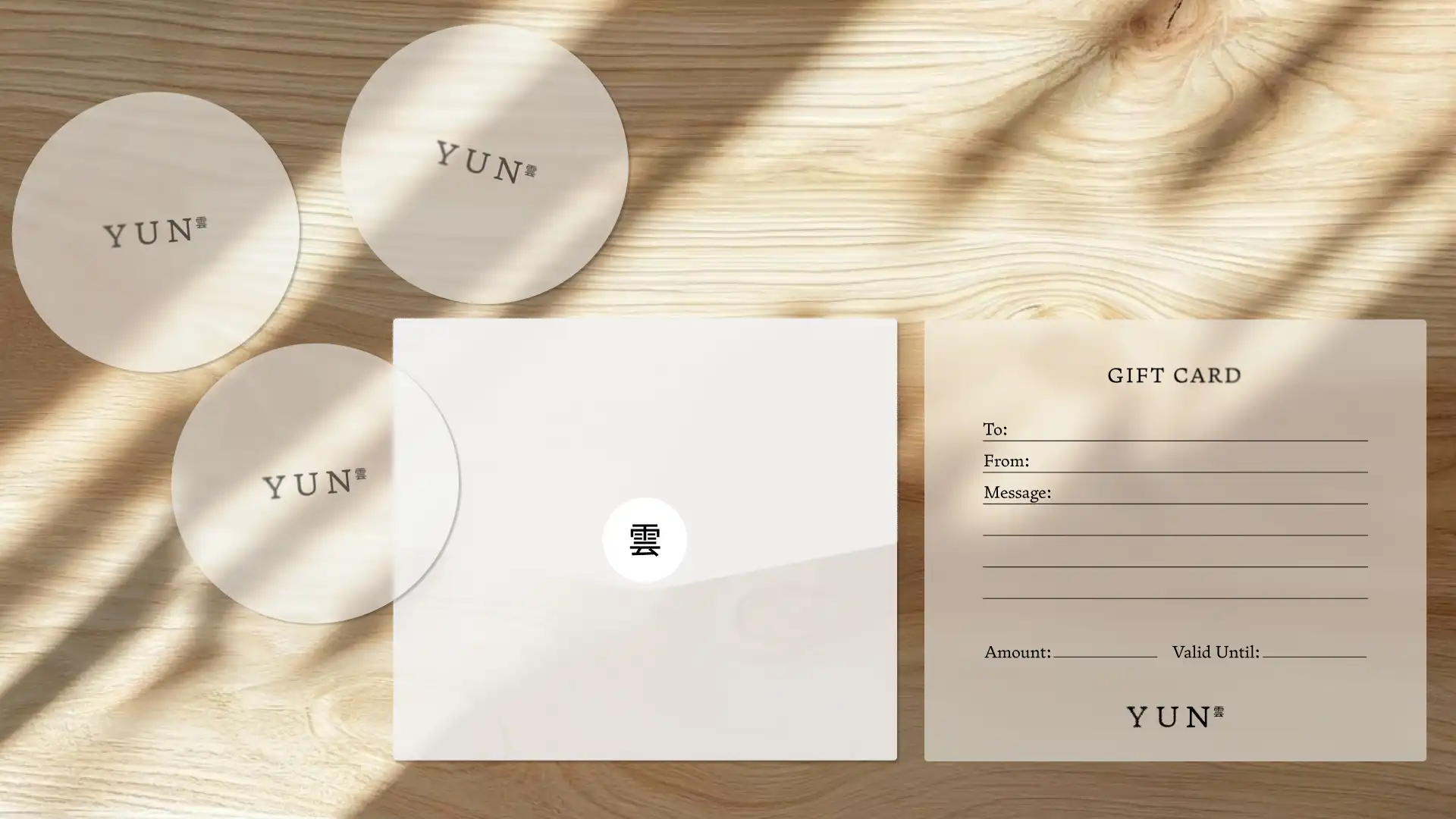
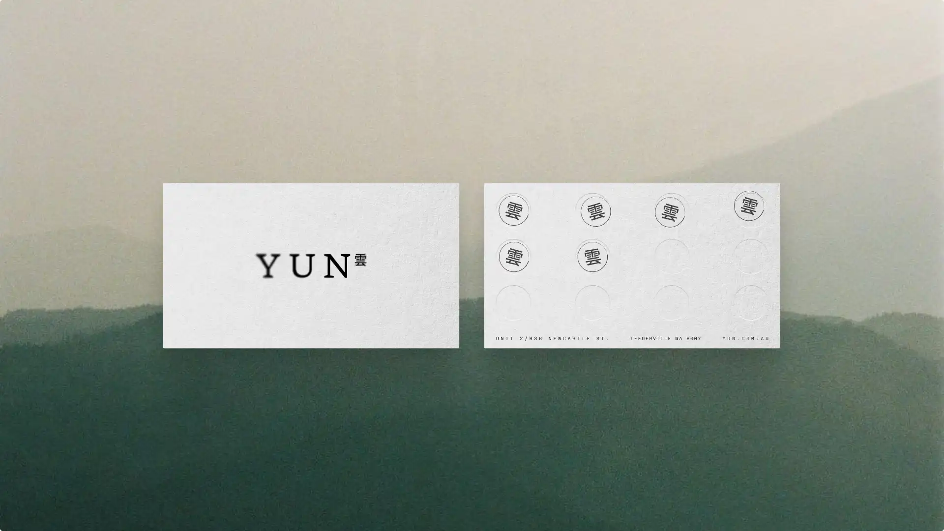
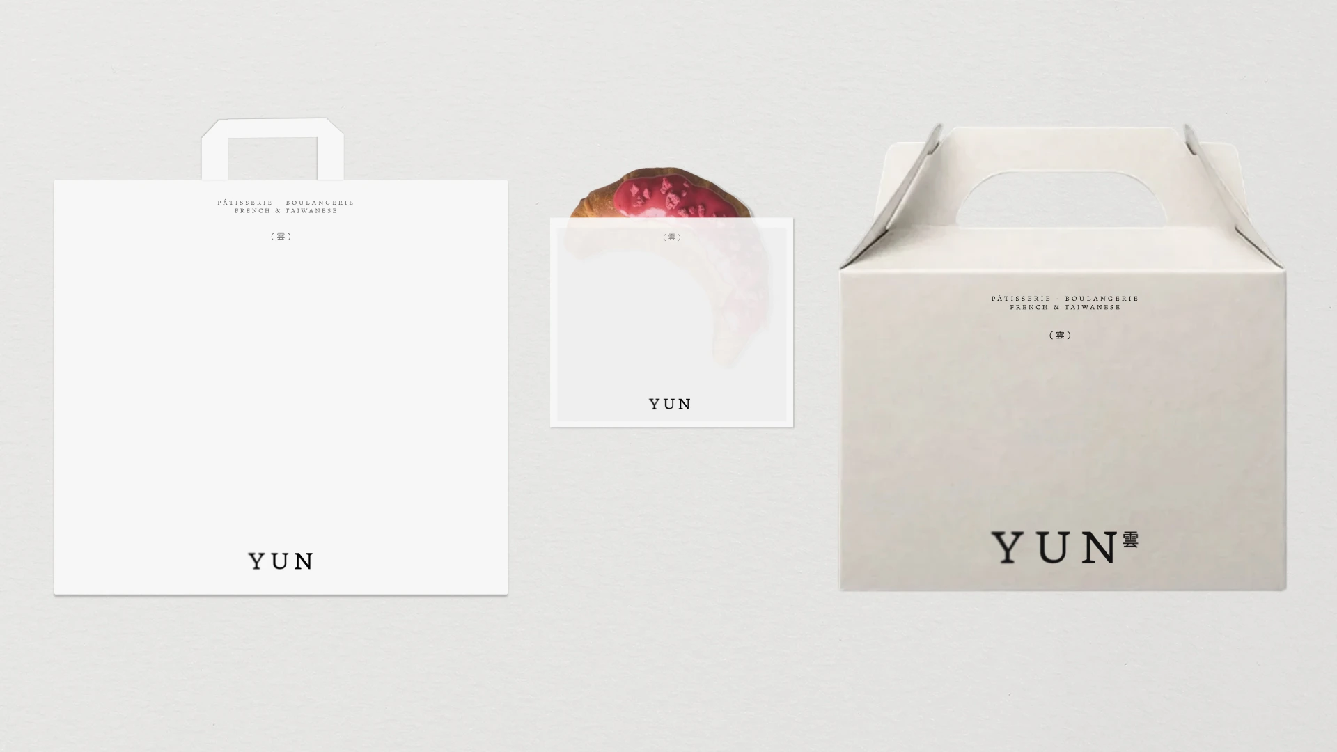
We built a visual identity and brand system grounded in that same quiet discipline. A logomark inspired by mist drifting across tea fields pairs Latin letterforms with the Chinese character 雲, unified by a gentle blur that gives the mark atmospheric softness and depth. The colour palette – creams, warm neutrals, muted greens – draws from the materials and landscapes of the craft itself.
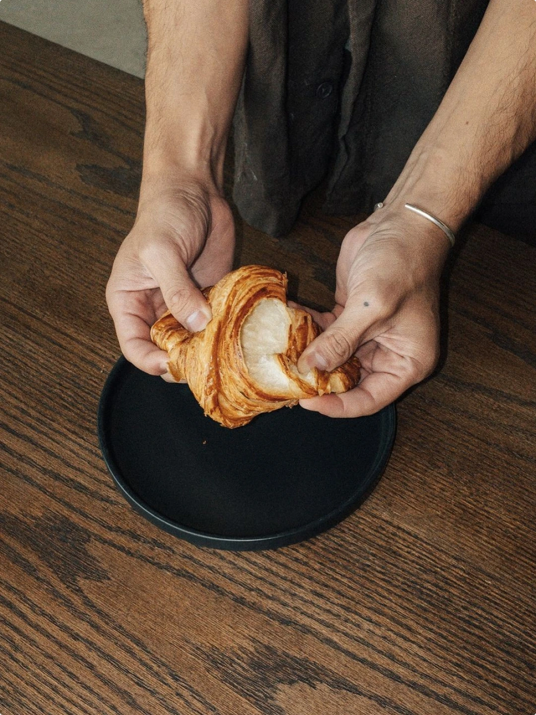
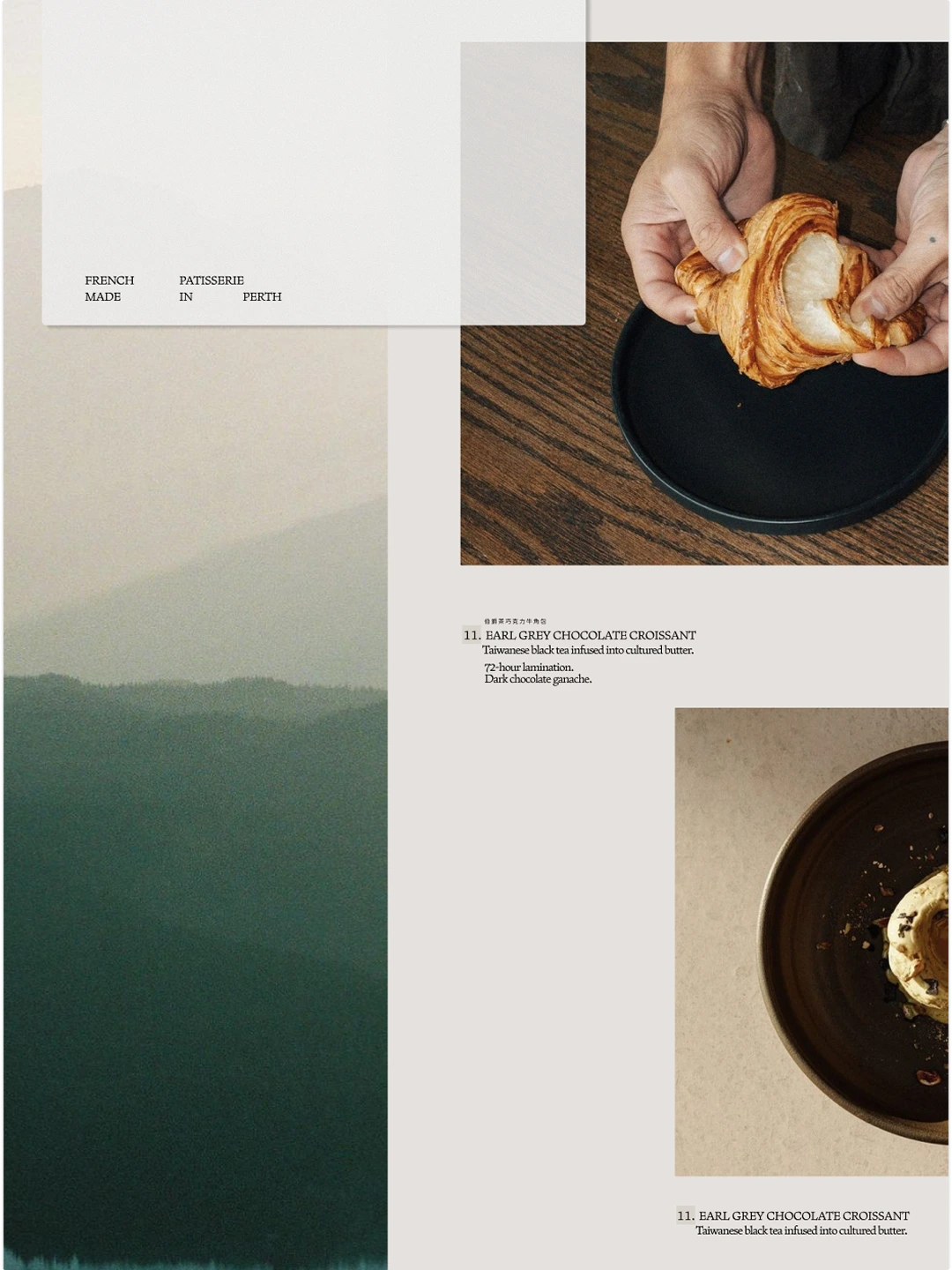
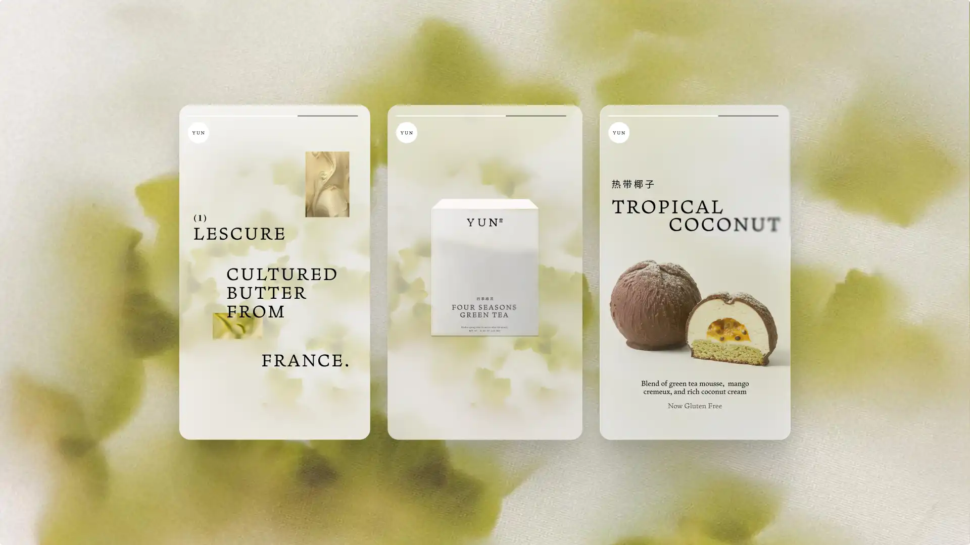
Photography direction follows the same restraint: minimal composition, soft tonal contrast, and controlled depth of field that keeps layouts light and spacious. Typography, tone of voice, and a set of graphic tools (blur, noise, progressive layering) were all designed to reinforce the brand’s considered character – creating an identity that feels tactile, serene, and unmistakably intentional. A brand that trusts process over performance.