A visual identity for one of Perth's most meaningful industry events.
How we designed a new identity for an organisation at the intersection of industry and humanity, without compromising either.
The Oasis Ball is Western Australia’s annual gathering of the advertising, marketing, media, and communications industries – part awards night, part gala, and entirely focused on raising money for Oasis House, a Salvation Army initiative supporting young people affected by homelessness, family violence, and neglect. Now in its 29th year, it’s one of the longest-running industry charity events in the state.
When the Oasis committee approached us, they had three decades of history and a legacy logo with nothing to support it. Every event was designed from scratch, with no visual continuity between the Ball, the annual Sleep Out, and the Cheque Presentation, no guidelines, and no way to hand creative work to partners, sponsors, or future committees without losing the thread entirely.
We were brought in to design a brand identity that could represent both the industry and the people it served with confidence and respect, ready to unveil at the 2026 Oasis Ball.
No existing brand system
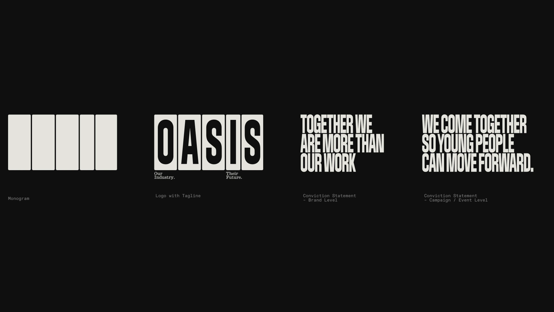
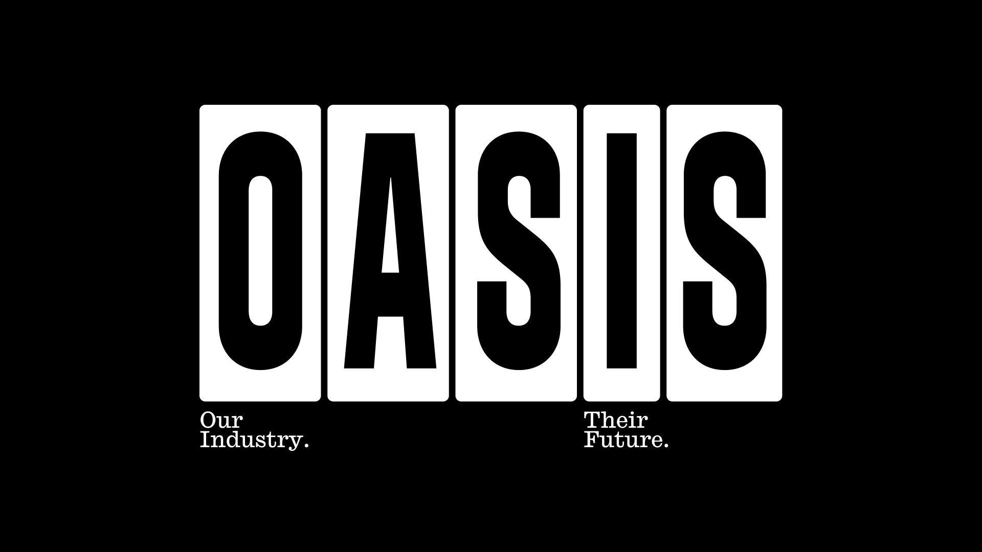
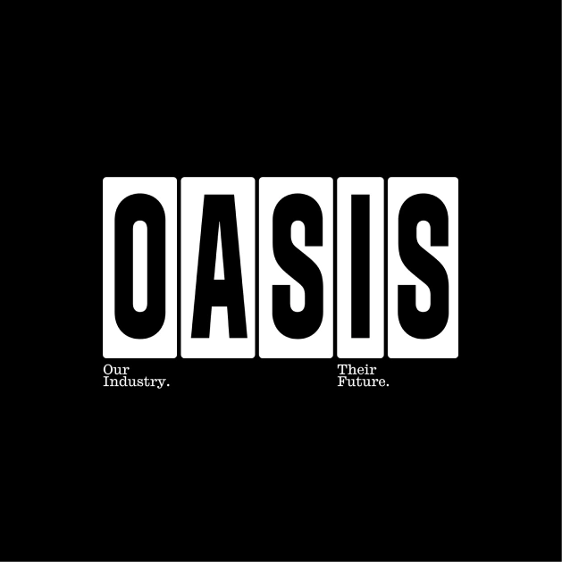
A complete brand architecture
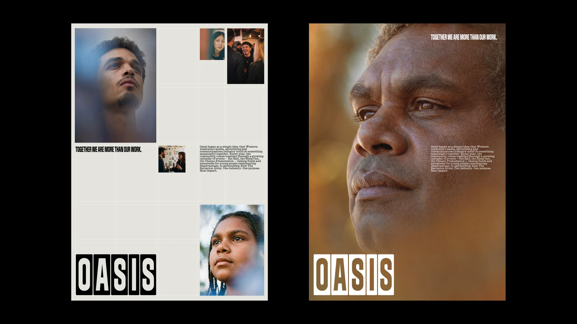
Representing people with dignity
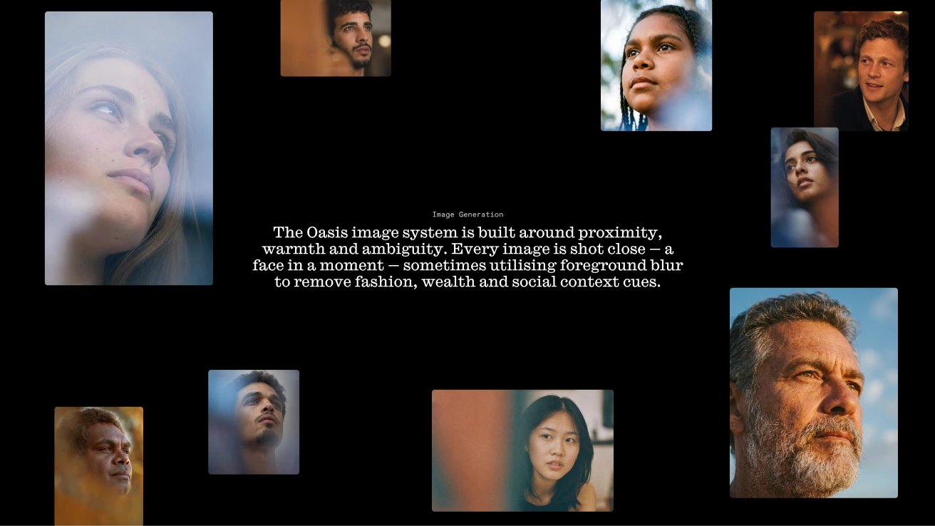
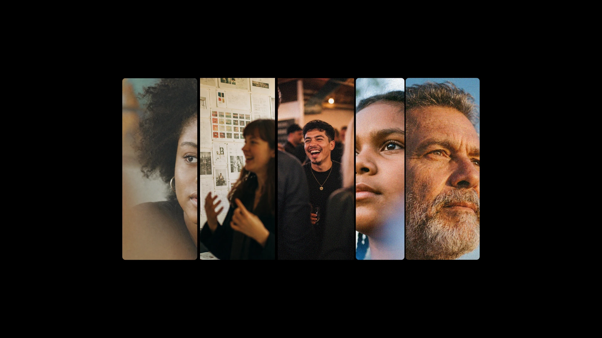
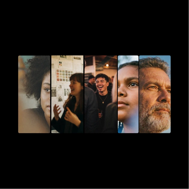
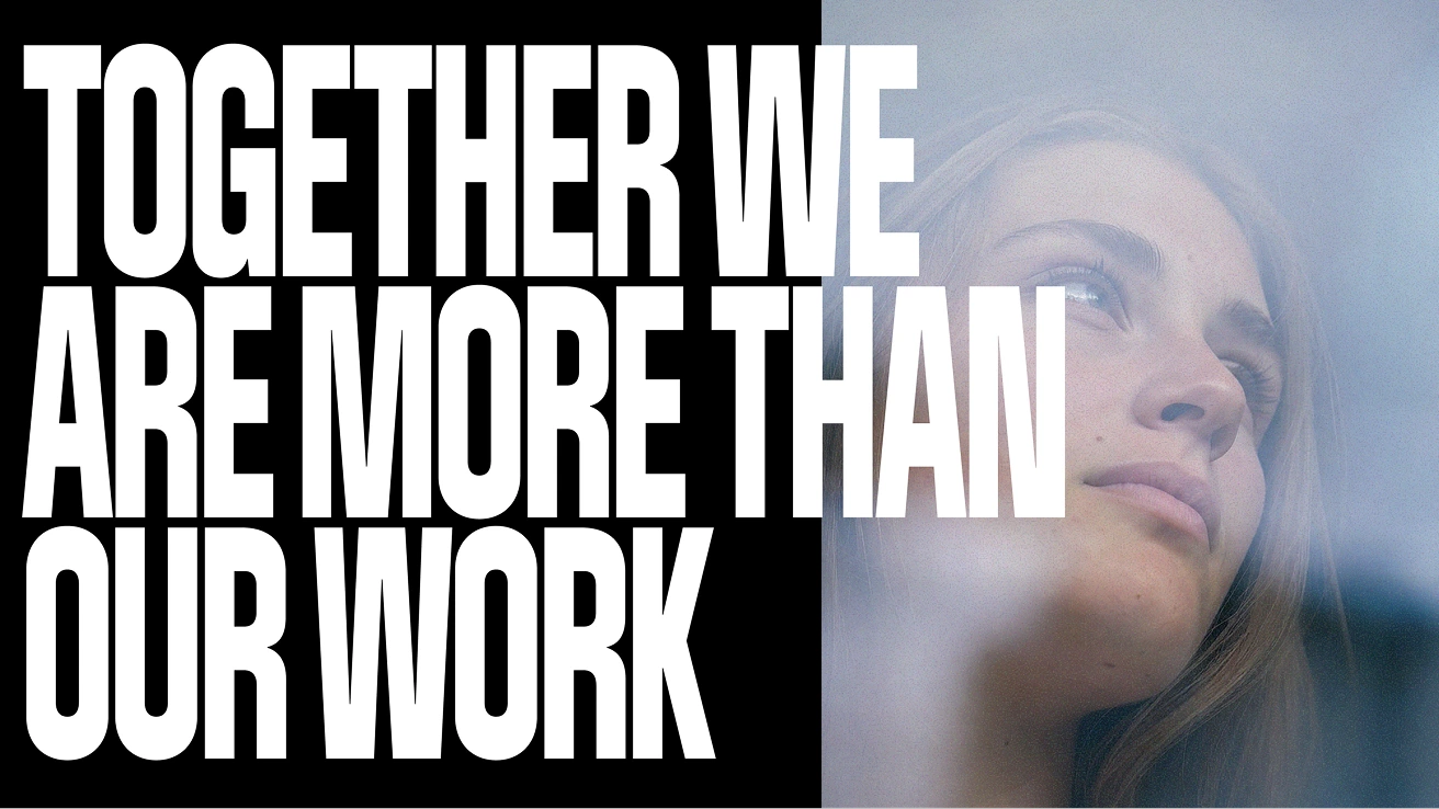
Tight framing, deliberate ambiguity
Serving two audiences at once
Industry energy as the entry point
"We were honoured to be asked to be part of this project. The committee is made up of people who could spend their time on anything, and they choose to spend it making sure young people have the stability and support to rebuild their lives. That's the kind of work we will always make room for."
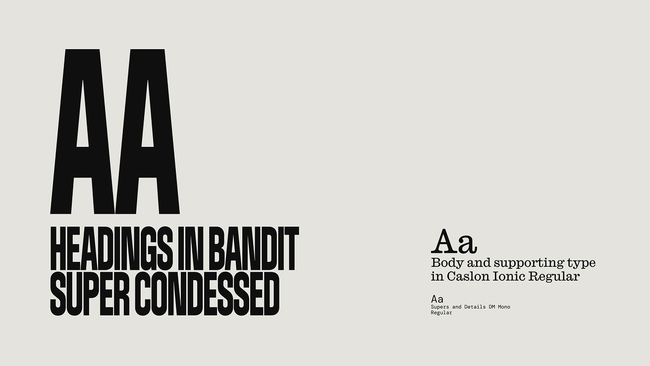
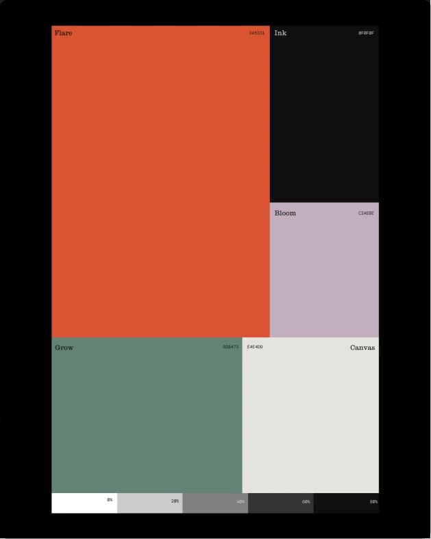
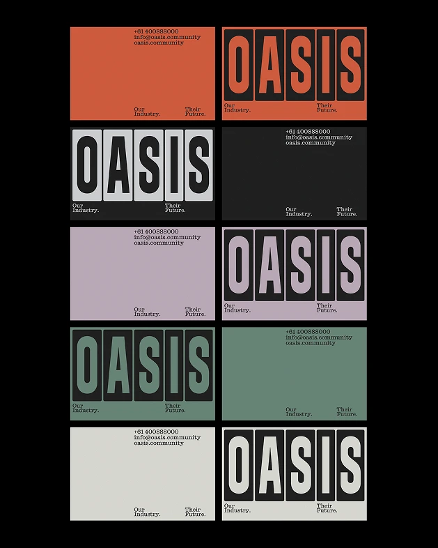
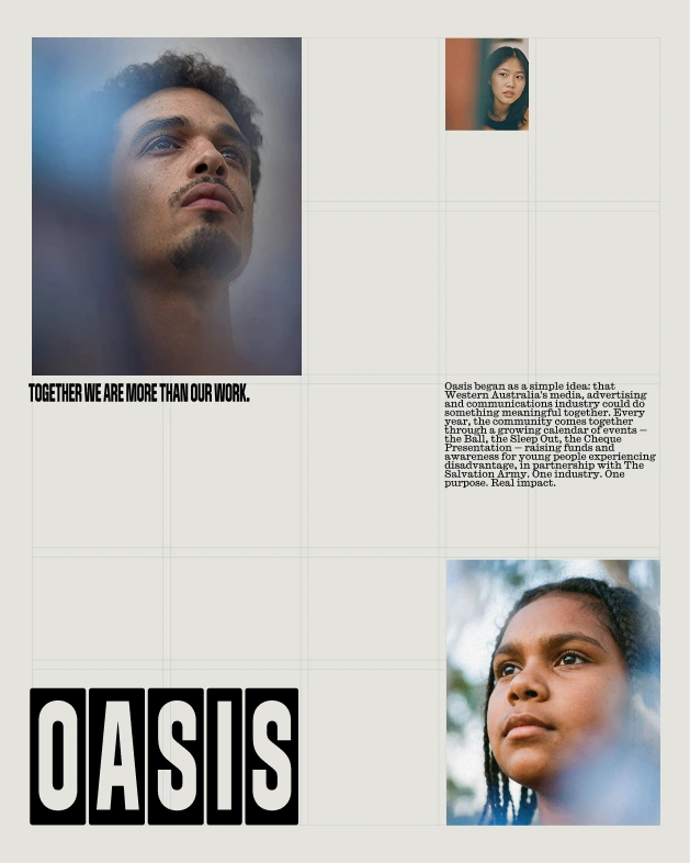
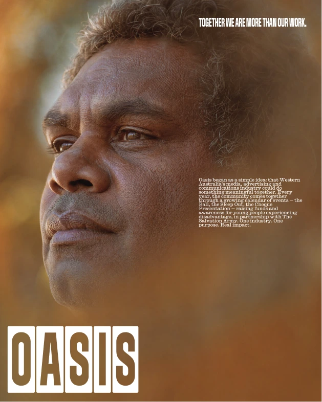
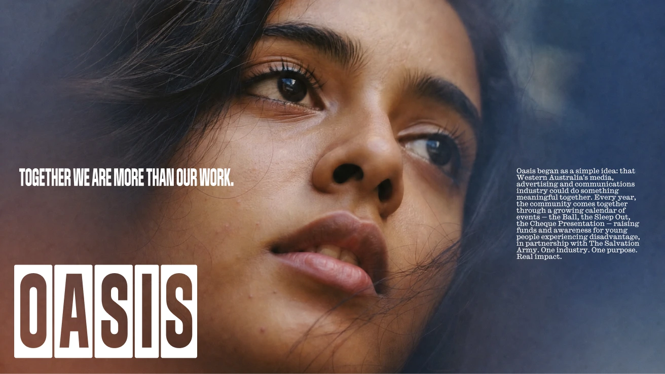
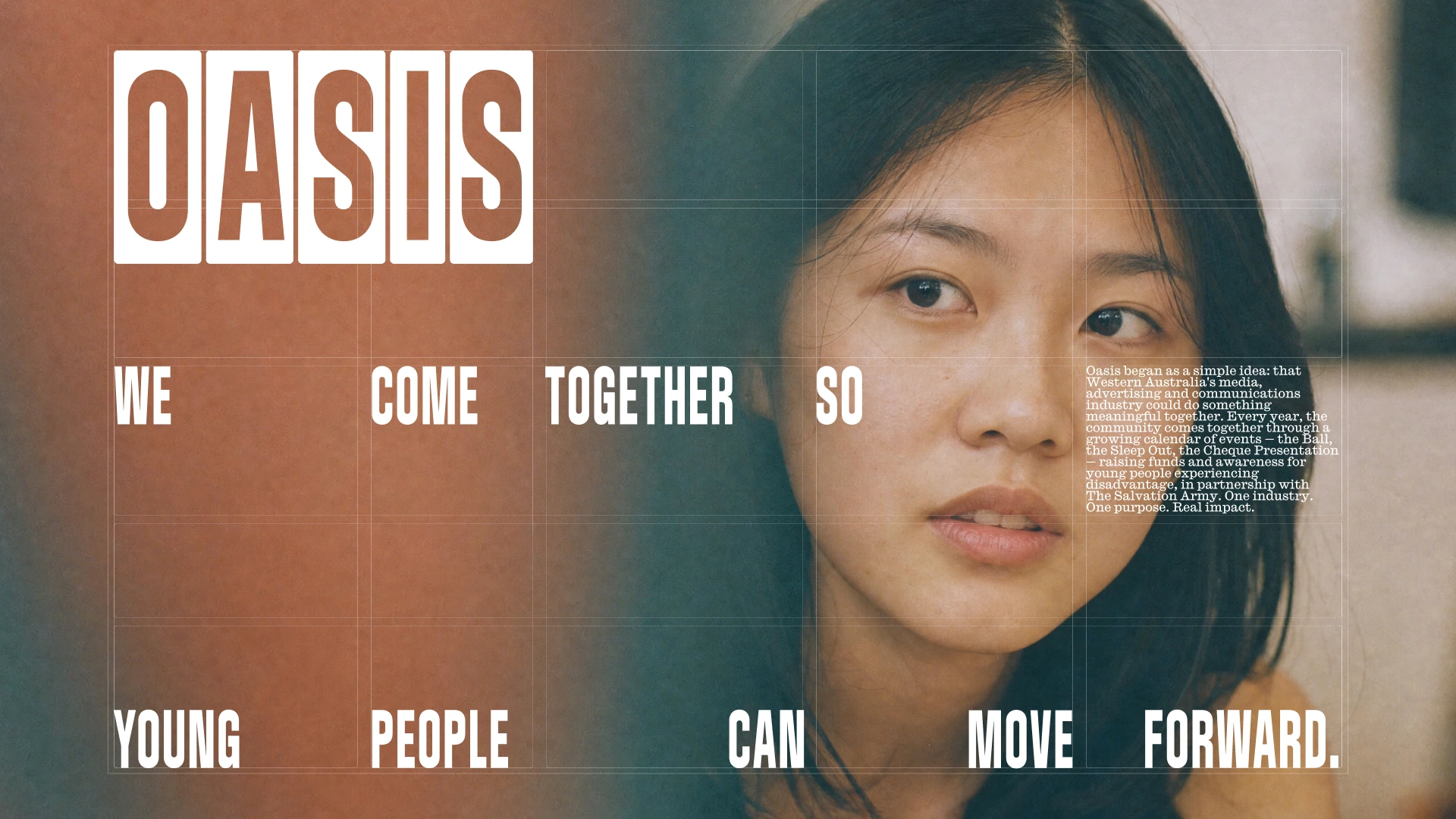
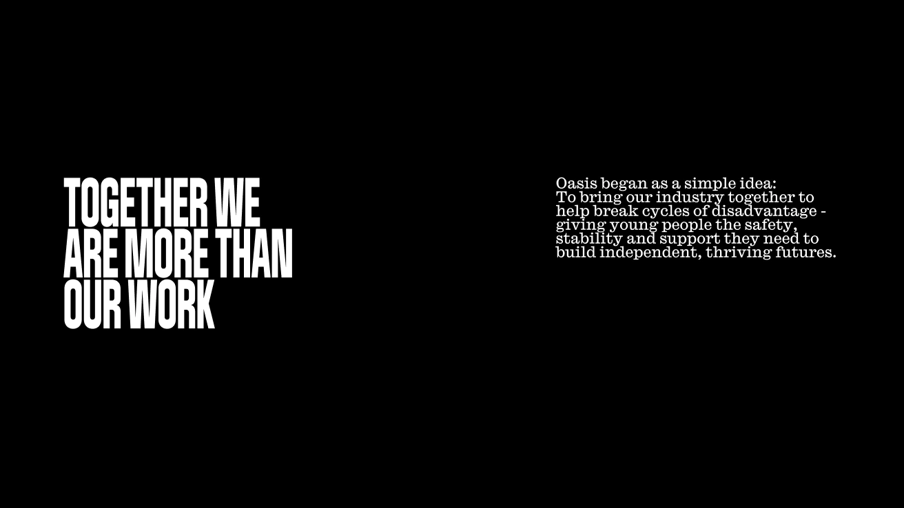
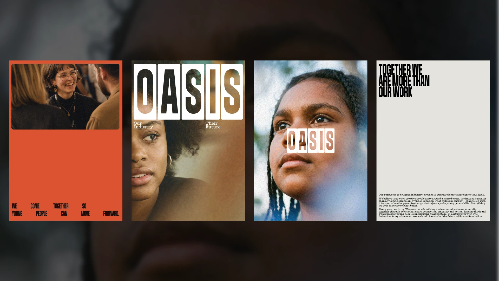
"Oasis exists at an unusual intersection – a creative industry organisation whose purpose is deeply human. The brief called for a brand that could hold both of those truths. We built the identity around the word itself. Five letters, five columns, combined in a flexible grid where images and type could work together in bold, dynamic ways. Using tightly cropped photography was key to resolving the juxtaposition between the industry and the cause, letting the viewer's imagination do the work."
"Oasis was a special one – bringing it to life felt important and we really wanted to do it justice. Designing for good is always so rewarding. You come in thinking about grids and leave thinking about people. That shift is the best part of this kind of work."